Goen . J Clothing store
I was inspired by the Korean brand I love, Goen.J.
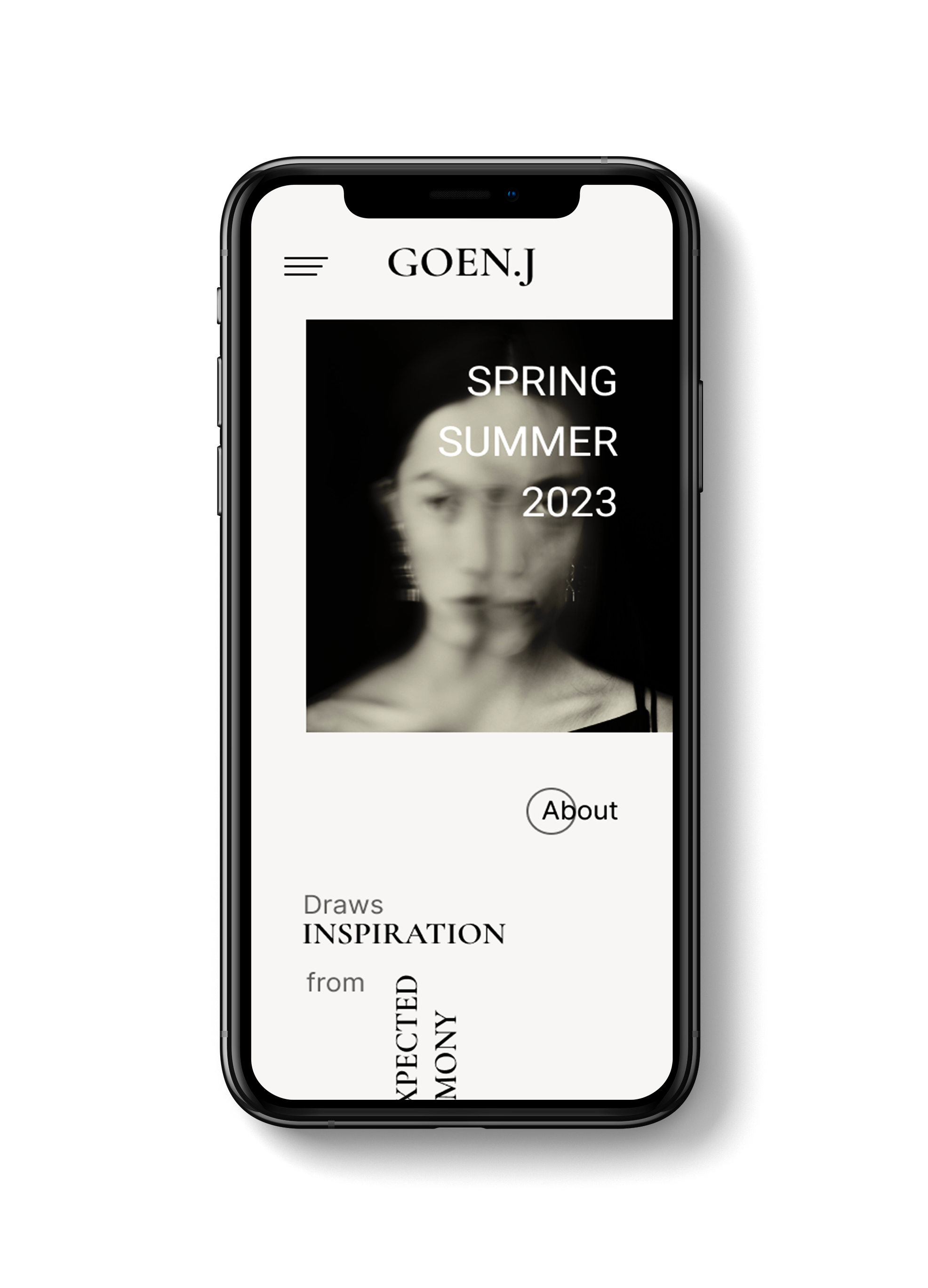
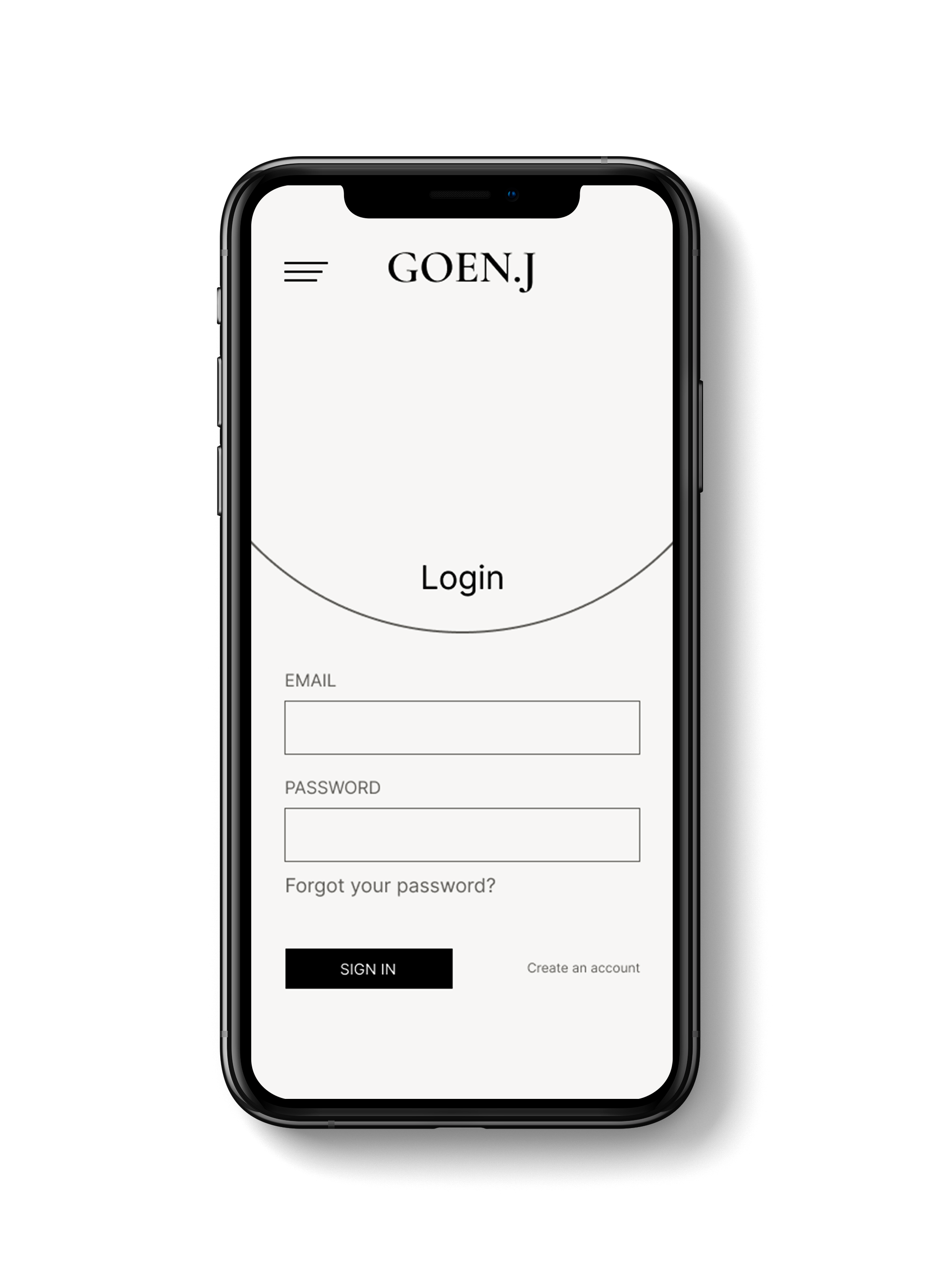
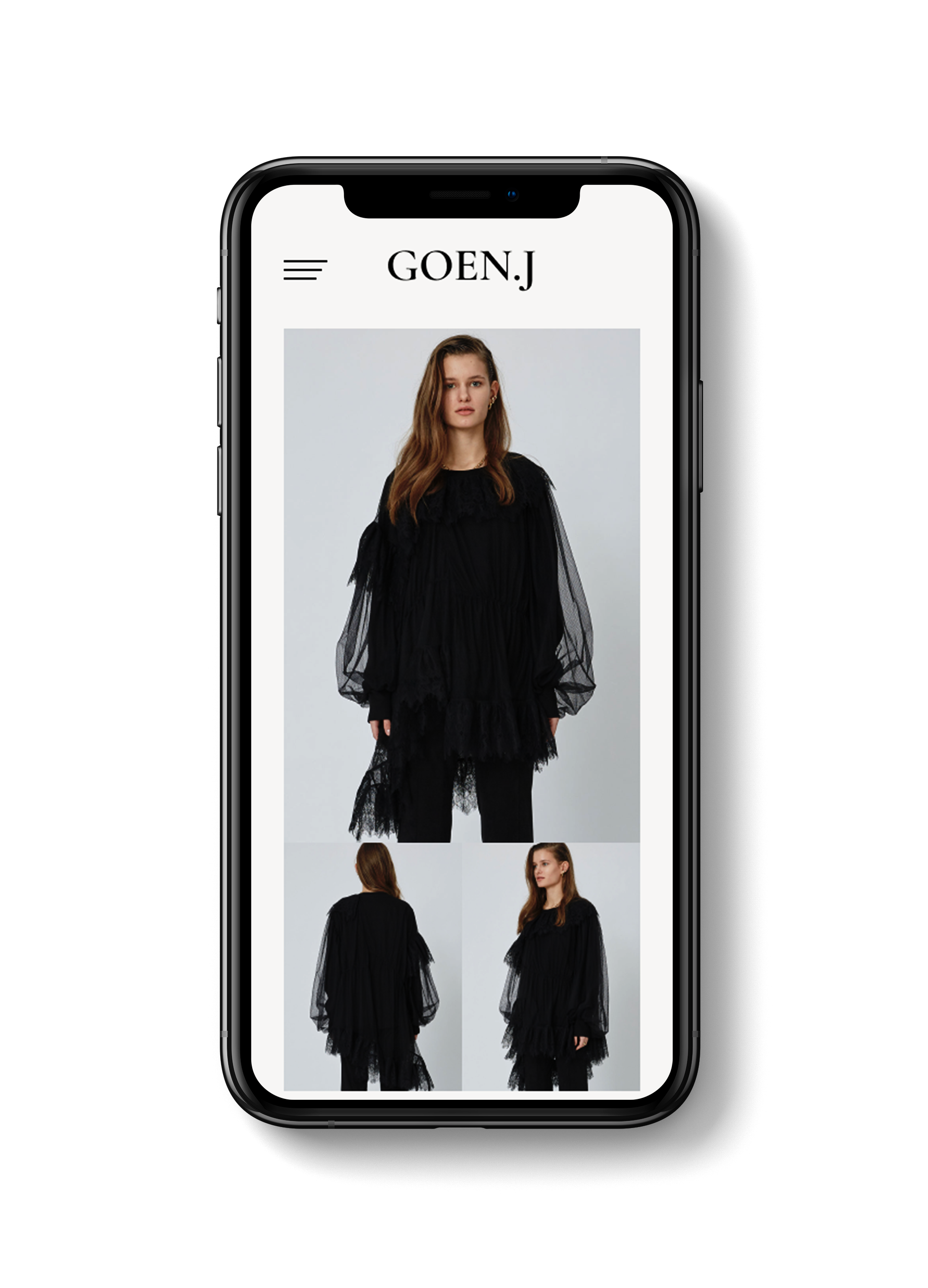
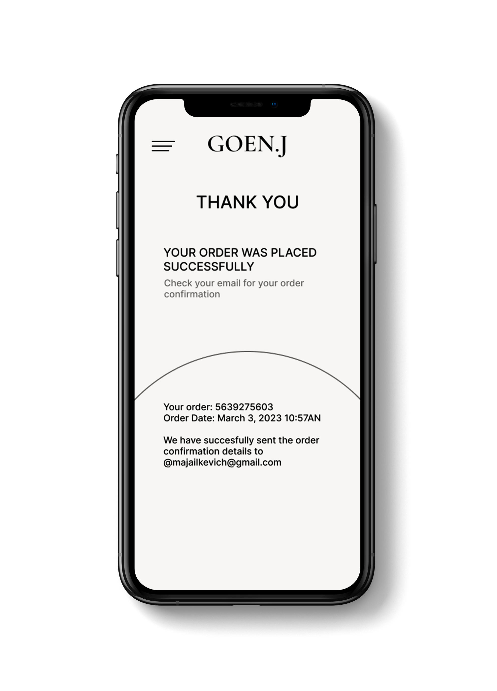
I redesigned both their mobile application and their logo. While I was in Korea as a model, I discovered this brand, and I've wanted to do
something special for them ever since.
I prefer Sans-serif fonts because they are easier to read and less likely to cause eye strain than serif fonts, which have decorative flourishes
at the ends of each letter. I use a sans-serif font for my logo to convey elegance and uniqueness. This combination has distinct advantages
because it can provide simplicity and readability while conveying a sense of professionalism or authority while remaining modern and streamlined.
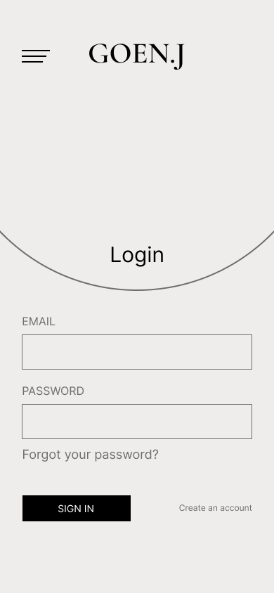
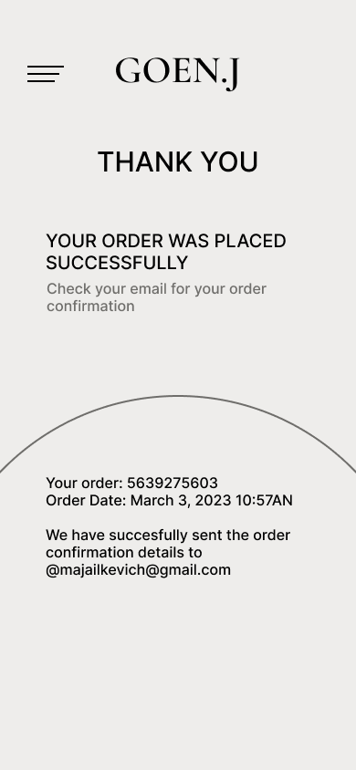
To show the user's journey around the site I designed a home page, sign in page, collection page/shop page, cart page, contact information page
and thank you page.
and thank you page.
User Flow
Moodboard
To create a simple and clean aesthetic, I used black and white, neutral beige colours.
Black conveys elegance, sophistication, and seriousness that connects with my brand. It also gives a design depth and contrast.
Black and white create a striking contrast that draws attention to key elements in a design.
I used a very light beige colour for the background,
a neutral hue created by mixing white and beige.
Neautral beige is a versatile colour that creates a relaxing and soothing atmosphere. It also represents a sense of coziness and warmth.

Execution
